rockstrongo
Retired Footballer
yeah its not there,luckily i chosed 14How do you play Argentina League in PES 2011 mate?
Follow along with the video below to see how to install our site as a web app on your home screen.
Note: This feature currently requires accessing the site using the built-in Safari browser.
yeah its not there,luckily i chosed 14How do you play Argentina League in PES 2011 mate?
Im listening to 5 hrs podcast on San Lorenzo, and very interesting story on Boedo, and then moved to a really bad area and back to Boedo.@rockstrongo yeah, not many people know this, but Viggo grew up in Argentina, which explains his hardcore support.
San Lorenzo are cool, and they have an interesting story. They recovered their stadium and placed it in their historical Boedo neighborhood. The Argentiniean league is very passionate for sure! Los Cuervos are one of the big-five in Argentina, and they won their first Libertadores I believe in 2015, so you'll have a good team to work with!
also, im close to finish the formations part
@Chenghis.Khan i ask you, do you have any suggestion for this part that you would like to improve from pes fan editor?
- edit player positioning (like you do in the video) via arrow keys (like ingame)
- fit all the team settings on one page, so i can take just a single screenshot and get everything. currently you need to decide between the team settings (A/A/B/B etc.) and strategies (r./l. side attack etc.) or take two screens and edit them in paint...
can be done, i thought people prefer drag n drop, but easily when you clic and move with the key arrows you'll be able to move the dot too
can be done too, this includes each formation stots? strategy A and B ? also i can add a function to export/ import the data so everyone can import formations with copy and paste
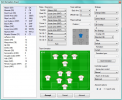
also this is the format i decided to follow for now (picture from pes2008 editor)
View attachment 195678
question, its useful having the players at your left? or should i remove it? or only put the first eleven?
thanks for your words
Did enjoy it, felt very different from most pes ive played@rockstrongo nice! Against Estudiantes de la Plata, no less! (I believe this was the last year they had Revon, sorry, Veron?) Glad to hear you're enjoying PES 2014, an underappreciated installment!
@MKC I'm not sure if you play PC or Console PES 2018.. If it's on PC, I recommend you try this gameplay mod. (courtesy of @nesa24)
I like playing PA1 because of stats weight and other preferences. However, this gameplay mod should work with any pass setting! I am playing it with Top Player, 16 minutes, and having a blast with it! One thing I love about this mod is that it completely fixes the defensive issue, where players in the vanilla game take too long to close down space. I'm finding it a challenge in TP (I've heard Superstar is a bit too much momentum-based), and the gameplay is playing very realistically.
I appreciate the tip, sadly I play on PS4 though. I hope to build a PC in the future that can actually handle things from 2003 and above, sadly I'm using hardware that can at best run video games that are 20 years old, without having issues that is. I'm preparing for the time I can build my dream PC though, already downloaded the PES2011 camera tool just in case the download links ever stop working, PES2011's cameras weren't my cup of tea to be honest.@MKC I'm not sure if you play PC or Console PES 2018.. If it's on PC, I recommend you try this gameplay mod. (courtesy of @nesa24)
Marvelous!can be done, i thought people prefer drag n drop, but easily when you clic and move with the key arrows you'll be able to move the dot too
can be done too, this includes each formation stots? strategy A and B ? also i can add a function to export/ import the data so everyone can import formations with copy and paste
also this is the format i decided to follow for now (picture from pes2008 editor)
View attachment 195678
question, its useful having the players at your left? or should i remove it? or only put the first eleven?
thanks for your words
export/import would be very nice indeed
definitely keep the player list. the 1st 11 is most important but i'd keep the whole squad. two reasons:
1 - you can identify who is who on the pitch if you have a list with names & numbers (& player roles but ideally the roles would be shown in the pitch window).
2 - if you wanted to create a tactic and share a screenshot () you'd want a list of the whole squad included.
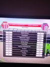
i assume for pes5/we9 there will be the A/B/C settings for zone press & counter attack in addition to back line & offside trap?
i have one big issue with the 2008 version:
in pes fan editor you can see all the arrows and defensive dots for all players all at the same time. with the 2008 editor i can't. if it stayed that way i'd keep using pes fan editor.
also to me the pitch screen in pes fan looks more aesthetically pleasing. in the screen above the players are way too big compared to the pitch. it looks fine in the video you posted earlier tho.
edit: if you want to save some screen space you can leave off the reigstered player roles in the squad list, the one in parantheses next to the player name. nice but not too important.
is the autosort function the same algorithm as ingame? if so then thats amazing and i'd probably use it often to test which players the cpu would line up.
oh and one more thing. if it had a screenshot button that would capture the entire editor window (either to clipboard or directly save as jpg/png) that would be gravy. not important just very comfortable.
Marvelous!
By the way, will it be possible to copy the training data from a Pes 6 Option file?
https://mega.nz/file/DYQmzIzC#KDfj5CwAFCvrZsc0zPDiN_mAd9MBNPWzQDxyz8Ll2JYCan someone link me a good patch or mod for pes 11 that improves AI/gameplay etc ?
Thanks for This OF. I played a few matches in JLWE9AC and I can say that it is a beautiful game. For me in the top 3 of all time. Next to WE7Ij and JLWE2008. Fighting in midfield, first touch, lots of fouls, AI. Better than WE9LE for me. I have the feeling that PS2 games look more solid, although maybe it's Placebo.If anyone is interested in an option file for J.League Winning Eleven 9 Asia Championship, here is one made by Adrian Ferrari that he uploaded a couple of months ago but the link has expired so I have reuploaded it here.
Here is a link to his original video on YouTube:
Tried installing it but when I click on save config it says only no DVD exe supported.
Get it, that's fine, but only thing i can't give you for now because is out of my range of knowledge/is a pain in the ass to get it done and may cause too many unwanted bugs is drag and drop from that list of players, example replace the goalkeeper, you have to go back into the main screen
I know, in fact i was burning my head trying to fix that part, but maybe what i can give you is a button to switch between DORSAL NUMBER/ROLE/OFFENSIVE/DEFENSIVE ARROWS displays on pitch, as for now i can only offer the first two but im working on the last four on screen, i couldn't properly get it working with the four together, i know pes editor use some dots for defensive but i wanted to replicate the pes formation internal setting and use arrows depending on the lenght of each will be a type of defense, low normal high, also the setting for this wont be a dot, will be more a combobox, but i could use something like 3 option buttons (i know is a little tech term but google them and you'll get it), what do you think of this?
as for the pitch, it will be the one from the video it covers the basic needs and is not that bad for the eyes, oh and also will include limitations by position/role, last time i was working on that in fact
I dont think i can implement this, unless you or someone knows how does it works in game or any other alternative it aint a bad idea, but it won't be a priority for now as i wanna cover the basic needs
I know the one from pes editor handles pretty good the formation setting, but not gonna lie some stuff get hard to do it or redo, but i promise i'll try to get as close as pes fan editor gets, but on my approach too
you can still use both or only one, mostly asking you since you're the expert on the formation window and if i can improve something that is not perfect i will
is it very important to you to display the defensive arrows as actual arrows?
you could instead color the player symbol in of 3 colors indicating the defensive setting for example. so a circle colored in either black/white/lightblue/darkblue and the number and or role written inside and the usual attacking arrows in white on the outside?
no problem. drag & drop in main screen is fine
that's nice.
you just made me think of something.
just a crazy idea.
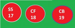
do you think it could be possible to allow positioning a striker or defender role in the midfield area? for example in the default pes 5 OF, konami placed barca's ronaldinho as SS in the midfield zone, a few clicks deeper than allowed for forwards. something that you can't do ingame or in pes fan editor.
not sure if i would actually use this often but i'm curious.
Love the whole idea! I will try to find a solution for offensive arrows i have an idea, i hope it doesnt make the movement of players too slow
sadly... drag n drop is actually an issue to implement, not gonna lie to you, so i solve that using buttons, to release, to transfer, to swap selected players and to swap all players in team, in fact im developing this for pes11-14 on ps2, psp and 3ds so far is what they got
I mean, i could just not put limits for position more than the pitch limits, putting only colours as reference, so yeah you can do it, i manage to do it via cheat engine with a few players, putting a CBT in the AMF zone, i didnt notice any crash, only crash that i notice? putting all offensive arrows in a players hahaha i haven't check the limit if im honest i was mostly playing around
more than two arrows also sounds very interesting!
if it is not a problem then removing the positioning limits would be nice. maybe use a toggle button to enforce/remove limits.
As someone that loves graphic design and UIs in general, I could go on for a while talking about this.random question : what is your favourite PES/ISS/WE in terms of user interface (menus, aesthetic, etc..) ?
Thanks for This OF. I played a few matches in JLWE9AC and I can say that it is a beautiful game. For me in the top 3 of all time. Next to WE7Ij and JLWE2008. Fighting in midfield, first touch, lots of fouls, AI. Better than WE9LE for me. I have the feeling that PS2 games look more solid, although maybe it's Placebo.
It's a dream for such games to receive an OF update for the current season.
Here is link for JLWE9C english patch. Just apply widescreen patch and is normal game without bugs.I agree with you. I've played a lot of WE9/PES5/WE9LE and JLWE9AC is the best version for me. The AI is a lot better than WE9LE and the overall package (anime backgrounds, music etc.) is great. Thank you @BillyKong for linking to the OF. One issue I had was the widescreen patch stopped working once I patched the ISO with Fernando's English patch. Is there anyway to fix this?
Well the big difference is that when they switched on WE7 to a new engine, they did them themselve and it was more about graphisms/animations but their mojo was all around ball physics. The changes wasn't that gigant for example like a pitch 15% bigger, or 360 degree or even thing that force them completely to change the game.
They accumulated experience and the engine didn't got any secret for them. I ain't neither a fan of WE9LE, i found it faster than PES 5 which was already faster than WE9. PES 5 got the right balance, and especially regarding fault (WE9 was my favourite version but after retrying... There's way too much fault for nothing. Got almost 35-40 fault in 2 games)
Well i like PES 2008 PS2 too (also the PS3 version with the recoil we got : it's a very deep game in fact.. Just not what we expected on 2007).
Then i tried WE 2008 : it's a bit like JL2008CC but with NT. To me those PS2 2008 version are the most balanced regarding fun, action, scoring, fault, variety, they did. Even PES 2008 which is a bit faster is still balanced by others type of errors > i noticed more miss in shooting for example.
When they add things, they often miss the spot like for PES 6 then they correct it quickly and with ease on the "final evolution" version.
The big thing with 2008 version is they didn't added special things in comparison to PES 6.
And to me, the fact that PES 5 era games was so different than the others was about the control when you dribble : the automatic "outside foot" push to avoid an opponent was very game changing. I won't lie : it's something that i loved in the past but when you relativise : you lost the simple turn "forward, down" and i believe it's better to have it as an option with R2 like on others versions... But it's really fun to dribble that way, you lost one thing but you gain another one.
@MKC : one thing about presentation i hated on PES was about the names over the head and forced to play like this, i don't like neither having no bar with names above. I hated it, visual pollution to me. I don't care when it's around the pitch like score, bar names, and i often look at the radar, but that thing...
I was like "finally..." with a breath of despair when they restored it for PES 2015.
The issue is there's no mods to change it. And the cursor alone act weirdly, it moves around the players head.
I love your commitment to retro pes/we. May more people share your enthusiasm and the world of retro pes/we will be better. Thanks to you and others I fell in love with this series again and I just enjoy playing the game. Thank you.Well the big difference is that when they switched on WE7 to a new engine, they did them themselve and it was more about graphisms/animations but their mojo was all around ball physics. The changes wasn't that gigant for example like a pitch 15% bigger, or 360 degree or even thing that force them completely to change the game.
They accumulated experience and the engine didn't got any secret for them. I ain't neither a fan of WE9LE, i found it faster than PES 5 which was already faster than WE9. PES 5 got the right balance, and especially regarding fault (WE9 was my favourite version but after retrying... There's way too much fault for nothing. Got almost 35-40 fault in 2 games)
Well i like PES 2008 PS2 too (also the PS3 version with the recoil we got : it's a very deep game in fact.. Just not what we expected on 2007).
Then i tried WE 2008 : it's a bit like JL2008CC but with NT. To me those PS2 2008 version are the most balanced regarding fun, action, scoring, fault, variety, they did. Even PES 2008 which is a bit faster is still balanced by others type of errors > i noticed more miss in shooting for example.
When they add things, they often miss the spot like for PES 6 then they correct it quickly and with ease on the "final evolution" version.
The big thing with 2008 version is they didn't added special things in comparison to PES 6.
And to me, the fact that PES 5 era games was so different than the others was about the control when you dribble : the automatic "outside foot" push to avoid an opponent was very game changing. I won't lie : it's something that i loved in the past but when you relativise : you lost the simple turn "forward, down" and i believe it's better to have it as an option with R2 like on others versions... But it's really fun to dribble that way, you lost one thing but you gain another one.
@MKC : one thing about presentation i hated on PES was about the names over the head and forced to play like this, i don't like neither having no bar with names above. I hated it, visual pollution to me. I don't care when it's around the pitch like score, bar names, and i often look at the radar, but that thing...
I was like "finally..." with a breath of despair when they restored it for PES 2015.
The issue is there's no mods to change it. And the cursor alone act weirdly, it moves around the players head.
I love this post, I feel like the menu's don't get enough credit and scrutiny in the series. The sights and sounds of each menu experience in the series is just as special and as unique as the experience on the pitch in each version too.As someone that loves graphic design and UIs in general, I could go on for a while talking about this.
I'm not really into the first few Winning Eleven installments, as they have that 90's arcade styled UI, it works, but to me that's about all it does.
PES3 is where I start to really like it, the style they went for, a sort of futuristic computer vibe from old films, is well made and consistent, the OST helps too.
PES4, PES5 and PES6 didn't really do it for me, it felt like they went back into the sort of style from early Winning Eleven installments, which works, but still.
PES2008 looked stunning, very sophisticated and with a color scheme that was easy on the eyes, also loved seeing the bench in the pause menu.
PES2009 and PES2010 went with a hip vibe, graffiti and stuff, not really my thing, some of my least favorite, though they functioned well enough.
PES2011 is the best one and it's not even close... elegant and sophisticated, without sacrificing functionality, it's just perfect and feels modern even today,
PES2012 was not as good to me, but the core was the same, so it's a close 2nd, not only in looks, but function, like the game plan screen introduced earlier.
PES2013 was fine, but a downgrade in every way, and it's here that menus started turning a bit more uninspired.
PES2014 doesn't look that bad, besides the main menu, but it runs so poorly that it left a bad taste in my mouth, I don't like looking at it.
PES2015 and PES2016 both had almost the same menu and it looked good, worked good, but nothing more than that.
PES2017 had huge square boxes with very little text, a lot of empty space, don't like it.
PES2018 is better, but still not good.
PES2019 had a bright look, big images that fit the whole box, a nice styling... I like it, just wish it was consistent, to many things still have square corners.
PES2020 and PES2021 were a downgrade in my eyes, the issues were still there, but the best parts were gone, I don't like it much.
eFootball2022 and eFootball2023 have decent ideas, but the execution hurts my eyes, especially the color scheme and fonts, it's such a waste...