Navigation
Install the app
How to install the app on iOS
Follow along with the video below to see how to install our site as a web app on your home screen.
Note: This feature may not be available in some browsers.
More options
Style variation
You are using an out of date browser. It may not display this or other websites correctly.
You should upgrade or use an alternative browser.
You should upgrade or use an alternative browser.
Your team's worst kit (hall of shame)
- Thread starter jackarmy
- Start date
- Thread starter
- #62
jackarmy
SWIM AWAY!!!!!!
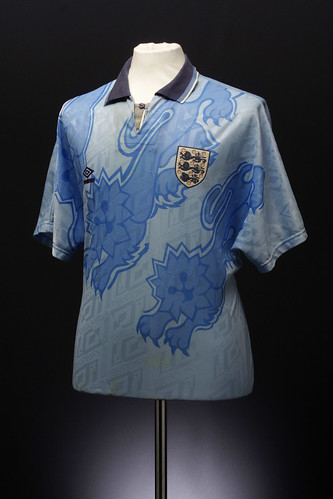
I remember that Saes kit, with the cartoon lions on it, horrible jersey. Mind you us Welsh had a distaster change strip of our own, from 1995!

Just what on earth is that front design supposed to be about? I think we only wore the kit twice. We had a green change kit from Lotto too after that and because of bad results, the FAW wouldn't commission a green change strip every again due to luck!
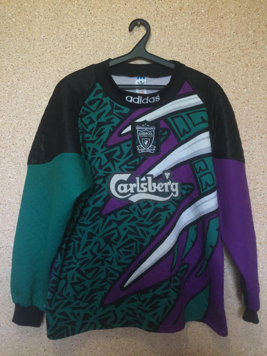
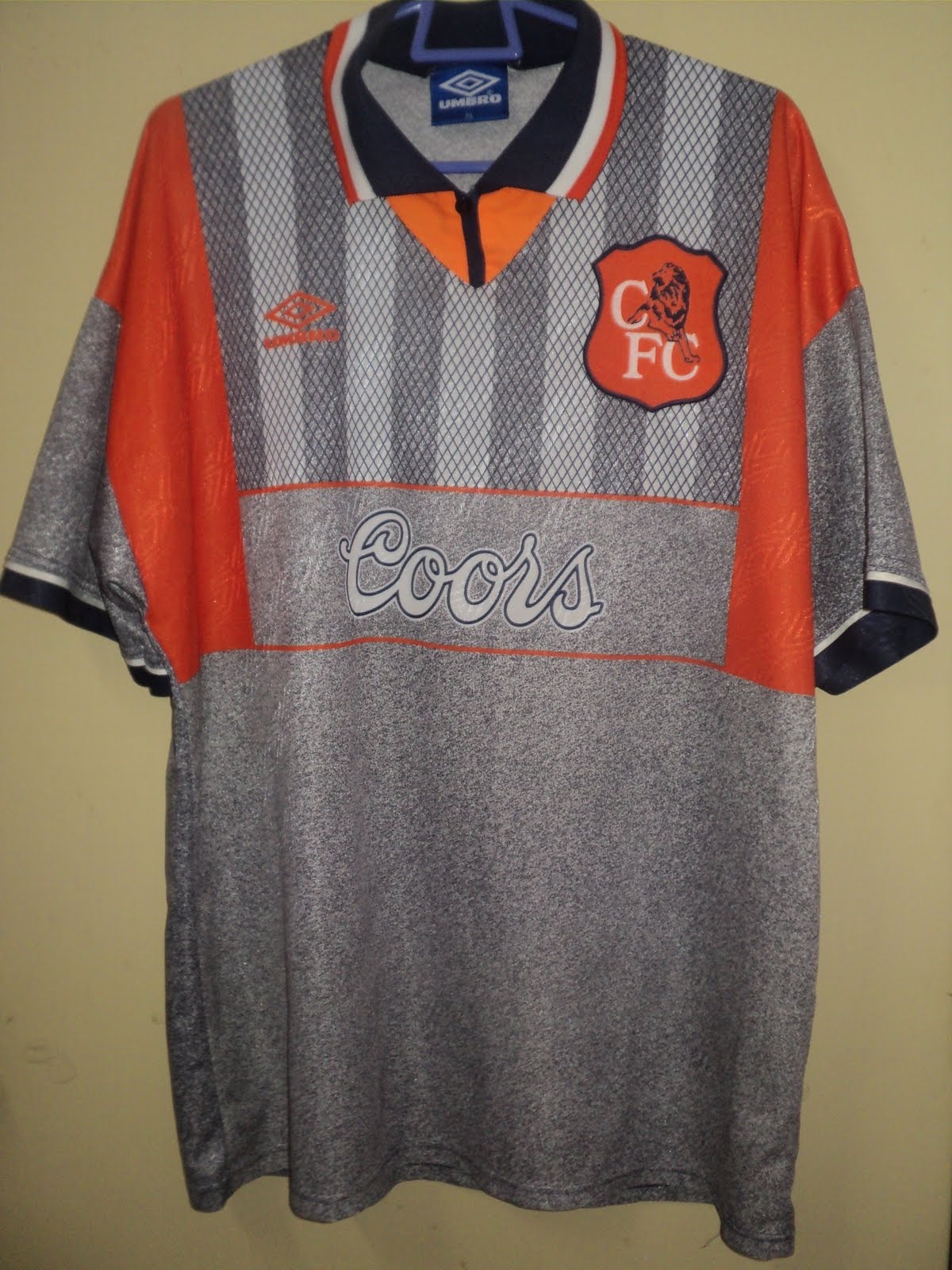
Back to club level, and for the Mighty Jacks, here's what I'd regard as our worst away kit!
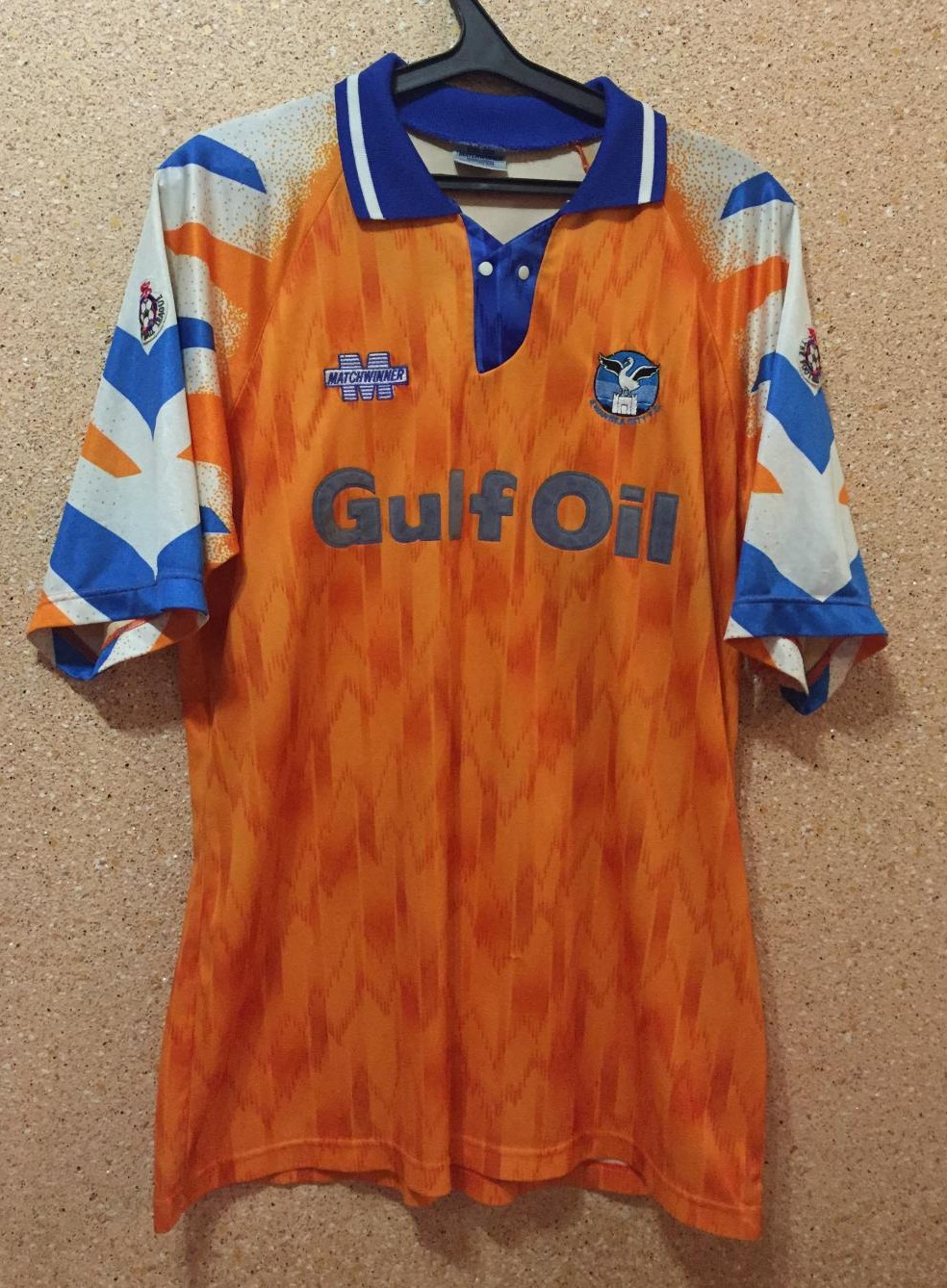
And this (same as the home design on the first page) was equally bad!
Just what on earth is that front design supposed to be about? I think we only wore the kit twice. We had a green change kit from Lotto too after that and because of bad results, the FAW wouldn't commission a green change strip every again due to luck!
Back to club level, and for the Mighty Jacks, here's what I'd regard as our worst away kit!
And this (same as the home design on the first page) was equally bad!
user name 99
Death Ramp
Going back to this thread, Independiente Limited Edition 2013.
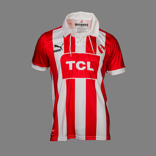
A striped kit was only used thrice in the club's history. This horrendous thing was wore in their debut in the Second Division, in which we even lost to a newly promoted team!
A striped kit was only used thrice in the club's history. This horrendous thing was wore in their debut in the Second Division, in which we even lost to a newly promoted team!
UJSupanova
@Bobothy
People slaughter Warrior for their kits, but reputable brands Adidas and Reebok had much worse designs imo


Kanouté
#NewEra
- 26 April 2008
I loved that one tbh
Godotelli
Stroking Silva's Hair

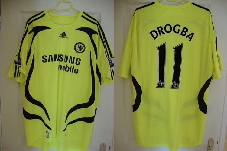
One of our worst but I love it

I loved that one tbh
I like that one too, I dont think thats an ugly kit at all
user name 99
Death Ramp
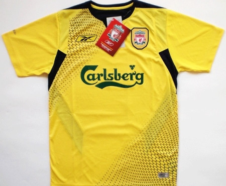
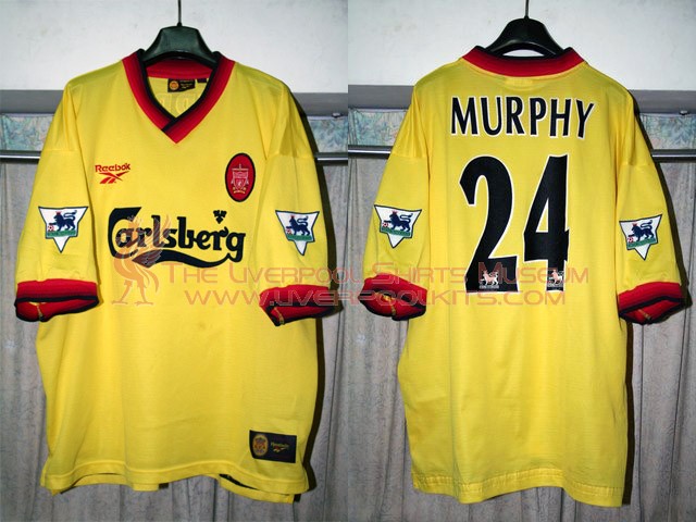
That Liverpool's class!
Cuky
International
Nike's 1st try with Croatia kits was awful (in 2001)


They haven't done any better with 2002 kits. Just look at how numbers and names are placed on home kit


They were designed without any background for numbers and names, but FIFA demanded that they had to be more visible. So they added this white background before numbers were pressed on kits so they often fell off during match.
They haven't done any better with 2002 kits. Just look at how numbers and names are placed on home kit
They were designed without any background for numbers and names, but FIFA demanded that they had to be more visible. So they added this white background before numbers were pressed on kits so they often fell off during match.
user name 99
Death Ramp
Argentina 2000/01, Reebok's last -and by far worst- try


Daniel_Juve
kitmaker
- 29 November 2011
- Team
- Juventus
Easy:


andy18cruz
Sth, sth ... dark side
Easy too. Light pink with grey. 

Plus this kit, that was made in order to prevent players from being hit by cars at night.

Plus this kit, that was made in order to prevent players from being hit by cars at night.
ThomasGOAL
Retired Footballer
- 15 March 2003
aluminium kit ! 
Daniel_Juve
kitmaker
- 29 November 2011
- Team
- Juventus
Omg that chrome kit! 
- Staff
- #76
The worst two BVB kits imo.


Juve kit its nice tho
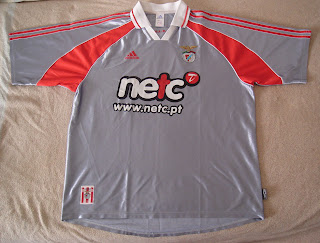
Benfica alumin one its so ugly
Benfica alumin one its so ugly
andy18cruz
Sth, sth ... dark side
Well to be true that silver kit wasn't normally that shinning. That photo was taken on the season presentation and there was a lot of lights. Ugly nonetheless. Still pretty shinning on regular matches.
Btw, the kid is Manuel Fernandes, currently at Besitkas.
Btw, the kid is Manuel Fernandes, currently at Besitkas.
Last edited:
amineken22
*****
- 9 November 2010
It has to be one of these following two, I'd pick the 1st one myself.
andy18cruz
Sth, sth ... dark side
That grey kit is probably the worst design I've ever see. 90's the dark era of football kits!
wow that kit its so ugly , what were they thinking ? Baseball jersey?
Kanouté
#NewEra
- 26 April 2008
lmao benfica aluminium worst one I've ever seen in this thread 
cfdh_edmundo
Maverick
- 30 December 2002
One of our worst but I love it
I was at a QPR v Man City game years ago, maybe 1997, and you wore a kit that looked a bit like that but much much worse. It was yellow and black stripes with "brother" on it. The yellow was regular (not hi viz) but the stripes were random, it looked like a kid with a crayon (or maybe a pensioner using "mario paint") had made it.
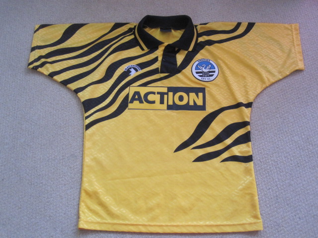
I can remember a Hull City kit which was actually a tiger print that looked hideous too from 1992 ish as well.
gonalois
KING OF LISBON
Benfica pink is good in my opinion ")
Portugal never had a bad kit(with me alive)
Portugal never had a bad kit(with me alive)
Milanista
Mangiamoli!

Just no.
Daniel_Juve
kitmaker
- 29 November 2011
- Team
- Juventus
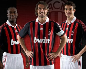
Milanista, those kits are fine, some (not me) could even say they are great, you are supposed to post the absolute worst you can remember.
For example, your current gold kit is horrible, it's like that Benfica silver kit but with a nonsense POCKET on it as a bonus

For example, your current gold kit is horrible, it's like that Benfica silver kit but with a nonsense POCKET on it as a bonus
amineken22
*****
- 9 November 2010
You really hate this kit Stef, don't you? Because it's the 2nd time you post it on this very thread.
user name 99
Death Ramp
I've said from the very beginning that Milan in that kit look like there are 11 referees!
Ernesto Lee
Mutant Atheist Player
Flamengo´s worst kits:

Last edited:
- Staff
- #90
