Your team's worst kit (hall of shame)

campos1.jpg

umbro :CONFUSE:
 
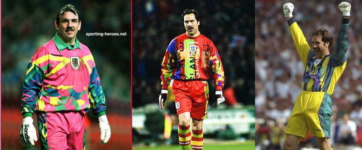
Umbro have a classy catalogue of past goalkeeper kits

uglygkkitx4es5.jpg


Sadly I owned the yellow one.

I'd also like to see the tradition of a goalkeepers moustache brought back.
 
Last edited:
Unfortunately my team has far too many embarrassing kits even in recent history.
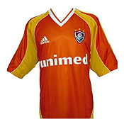
Third kits are like a license to screw up. So they did some 10 years ago:
laranja-2001_2002.jpg


But then again, they manage to screw the 1st kit too.
Horrible white squares and stripes:
Especial-Romario-Fluminense-Foto-Ferreira_LANIMA20111101_0092_38.jpg


Hideous with white triangles on the side:
gabriel_flu.jpg


But it wasn't enough, how could we make it worse somehow?
040327romario_flu.jpg


2980017608_a5dd64bcdd.jpg

Yes, I know. Gradient and fading effects in 2004... What were they thinking?
 
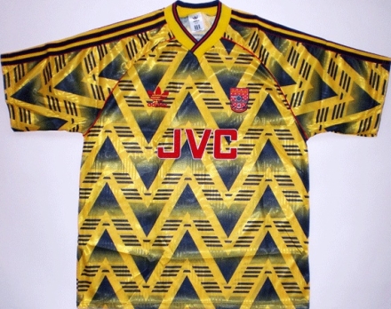
Arsenal away 1991 - 93

PgxKv.jpg

I was going to post this :LOL: although I think it has a special place in alot of Arsenal fans hearts as I still see people wearing it on match days....I have it aswell :DD

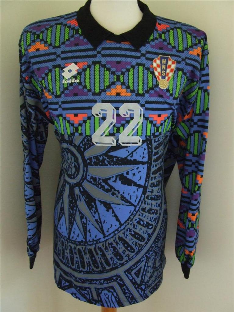
Bt the worst ones are always going to be goalie kits, alot of them are just crazy.
 
Back in the times when golden bling-bling around your neck were usual, these pink shirts matched very well I suppose.
 
In it's 100th anniversary, Boca Juniors released an ugly kit, specially because of the diagonal stripe, always present in River Plate's shirt:

5875B.jpg


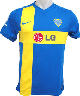
And later, an attempt to unclude sweeden's flag into our shirt, with a bad result of course.
boca+centenario.jpg
 
@lerp90: Both kits have an historical reference: the first one is for our second kit ever (the first one was pink...) and the Sweden one is obviously because our history says we took that flag colors for our club.

They aren't as bad as the one I posted, lol.
 
@Deranzeef
Yeah I know about it, but tbh I don't like them at all :P About the away kit you posted, it sucks too. IMO The current third looks awesome, but that one looks like a pijama.

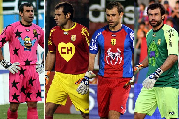
Talking of weird goalkeeper's shirts... Here's the king! Pablo Aurrecochea :BSCARF: Some of them are awesome, but the Krusty one... jeez...

Aurrecochea_comics_photo.jpg

0000280008.jpg
 
In it's 100th anniversary, Boca Juniors released an ugly kit, specially because of the diagonal stripe, always present in River Plate's shirt:

5875B.jpg


And later, an attempt to unclude sweeden's flag into our shirt, with a bad result of course.
boca+centenario.jpg

i like them both :D
 
ooops, I didn't get it...
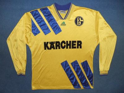
So here are "beautiful" kits of my team. those are that nice - i can hardly decide which is the most beautiful... :D

1995_away_front.jpg

trikots%20084.jpg

schalke-trikot-von-foto-bild-55801019.jpg

trikots%20086.jpg

1989_home_front.jpg

1306511416_original.jpg


and for my country - just these two "lovely" ones:

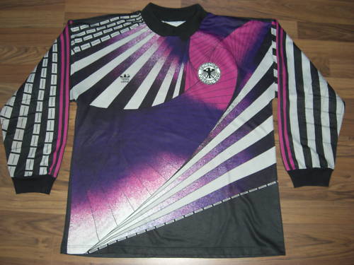
Bodo_Illgner_Trikot.jpg

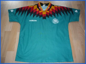
1994-300x225.jpg
 
Yeah,another PAOK one from there (1999-2001 away):

football_shirt_27371_1_600x560x0.jpg


:DOH:

And one from the 80's,where are the stripes?Yeah it was a home shirt

football_shirt_22225_1_600x560x0.jpg


Stripes over the sponsor and the badge... holy fuck.

Some Greek ones:

football_shirt_22868_1_376x450x0.jpg

football_shirt_18484_1_376x450x0.jpg

football_shirt_18486_1_376x450x0.jpg
 
Last edited:
i think the style those days was diferent thats why we see ugly now those 90s kits , whatever to see now they look rediculos some of them , things those days were more complicatet and much colors now are more simple and desings are way much better !
 
i think the style those days was diferent thats why we see ugly now those 90s kits , whatever to see now they look rediculos some of them , things those days were more complicatet and much colors now are more simple and desings are way much better !

but, why only 90's kits are seen as ugly?
in countrary 70's and 80's are classy whenever you see them ..
in general 90's was the era of randomness and non-sense in all clothes ..
 
Back
Top Bottom