Navigation
Install the app
How to install the app on iOS
Follow along with the video below to see how to install our site as a web app on your home screen.
Note: This feature may not be available in some browsers.
More options
Style variation
-
We're currently moving storage for avatars/attachments - please bear with us. We are migrating all files but some may not show temporarily. This may take 24-48 hours for all files to come across.
Sorry for any inconvenience! New attachments can be uploaded but it would be better to leave avatars for now as they could be overwritten as part of the migration.
UPDATE: This is moving slower than expected and will continue through the weekend.
You are using an out of date browser. It may not display this or other websites correctly.
You should upgrade or use an alternative browser.
You should upgrade or use an alternative browser.
XenForo 2.1 upgrade and server move complete
- Thread starter Mart
- Start date
- Staff
- #92
PRO_TOO
Team Heffernan
@Mart On mobile: the comments aren’t that great separated now (visually) . Big grey header with Ava pic followed by a big dark blue bar. Under the comment is nothing?! Edit: at least darken that small thin line underneath it.
Something looks off now, imo.
And please, can we swap that report button with the edit button?! Please. It’s possible and makes so much more sense!
edit2: the main font changed as well, right?! Just a personal opinion: I liked the old one better. Let’s see if I can change that for my design.
Something looks off now, imo.
And please, can we swap that report button with the edit button?! Please. It’s possible and makes so much more sense!
edit2: the main font changed as well, right?! Just a personal opinion: I liked the old one better. Let’s see if I can change that for my design.
Gave him a red card as a precaution, dont want him to get over excited.@Mart On mobile: the comments aren’t that great separated now (visually) . Big grey header with Ava pic followed by a big dark blue bar. Under the comment is nothing?! Edit: at least darken that small thin line underneath it.
Something looks off now, imo.
And please, can we swap that report button with the edit button?! Please. It’s possible and makes so much more sense!
edit2: the main font changed as well, right?! Just a personal opinion: I liked the old one better. Let’s see if I can change that for my design.


He has good points tho. Apart from avatar pics (where some heads are squashed horizontally or vertically on mobile) - its hard to divide posts.
Edit button is being used much more often than report, so it would be handy to have it shown in full for easy access.
Also - not a big fan of how @'ing people looks. I preferred when the name was showing in bold, instead of @'name'.
Jesus, I cant stand my moaning.. somebody give me a red card!
PRO_TOO
Team Heffernan
That’s another good point.Gave him a red card as a precaution, dont want him to get over excited.
He has good points tho. Apart from avatar pics (where some heads are squashed horizontally or vertically on mobile) - its hard to divide posts.
Edit button is being used much more often than report, so it would be handy to have it shown in full for easy access.
Also - not a big fan of how @'ing people looks. I preferred when the name was showing in bold, instead of @'name'.
Jesus, I cant stand my moaning.. somebody give me a red card!
We’ll get there...!

- Thread starter
- Staff
- #96
Ok, so , the logo takes you back to the homepage again (it was never meant to not do that). Fixed the profile page links. @ing looks better. I put a slightly darker border between posts - any darker and it looked weird in my opinion.
I can change the order of the Edit / Report links but it's a template edit so I'm trying to keep them to a minimum. I'll see if I can do it as an installable add-on or something along those lines.
The font did change but that's because the one we were using 'Droid Sans' is no longer hosted on Google (we were getting errors from them and it looks like it's a paid font now).
Thanks everyone for the feedback!
I can change the order of the Edit / Report links but it's a template edit so I'm trying to keep them to a minimum. I'll see if I can do it as an installable add-on or something along those lines.
The font did change but that's because the one we were using 'Droid Sans' is no longer hosted on Google (we were getting errors from them and it looks like it's a paid font now).
We don't have the old themes available any more - the ones we were using weren't completely compatible. We haven't changed anything with proxies or similar. We have image proxying set because we're on HTTPS and need to protect that, no other reason but that isn't a new setting. At the moment we have no plans to archive/delete attachments but if that ever changes I'll let everyone know in advance. They do take up space and bandwidth but we're ok for now (part of the reason for moving was for more space).What If some people want use old themes?
Why links changed to proxy? I mean I put imgur link but its changin like evo-web proxy. Example I need know original link to do something.
One more thing. Does evo-web give promise to never delete pics that we upload/attach here?
Thanks everyone for the feedback!
Last edited:
thapelo
What? League what?
- 13 October 2015
You guys can move the links but you must need re-direct
example : before that you can open that link ;
http://forums.evo-web.co.uk/showthread.php?t=70832
after that you need open that link after some change
https://evo-web.co.uk/threads70832/but you need do with manually. Cuz its not redirectin!
Move what you want but keep the original one
please fix and make automatic re-direct.. regards!
example : before that you can open that link ;
http://forums.evo-web.co.uk/showthread.php?t=70832
after that you need open that link after some change
https://evo-web.co.uk/threads70832/but you need do with manually. Cuz its not redirectin!

Move what you want but keep the original one
please fix and make automatic re-direct.. regards!
Madhu Chettri
Football Fan
- 13 May 2017
- Team
- FC Barcelona
Links that appeared in blue before now appear as any other text. This has reduced the distinction between links and plain text. The overall work is appreciated.
PRO_TOO
Team Heffernan
Hey @Mart ,
Doesn’t the red colored page number links at the bottom of the site look off compared to the overall color scheme?! Maybe some blue-ish or grey-ish color would suit better.
Can we have those page numbers being shown on the top of the page as well please?!
And yeah, I know, it’s Sunday...

Have a good one y’all!!
Doesn’t the red colored page number links at the bottom of the site look off compared to the overall color scheme?! Maybe some blue-ish or grey-ish color would suit better.
Can we have those page numbers being shown on the top of the page as well please?!
And yeah, I know, it’s Sunday...


Have a good one y’all!!

slamsoze
International
- 28 September 2010
It seems off but it works better on Dark Theme. Grey and dark blue looks a little bit camouflaged combined with the dark background.Hey @Mart ,
Doesn’t the red colored page number links at the bottom of the site look off compared to the overall color scheme?! Maybe some blue-ish or grey-ish color would suit better.
Can we have those page numbers being shown on the top of the page as well please?!
And yeah, I know, it’s Sunday...

Have a good one y’all!!
PRO_TOO
Team Heffernan
Maybe that purple/blue-ish color used for the preview button and when using quotes (in dark mode) is a good compromise.It seems off but it works better on Dark Theme. Grey and dark blue looks a little bit camouflaged combined with the dark background.
Sticks out in dark and would fit the light skin.
- Thread starter
- Staff
- #103
Dark/Light use different colours - on Light it's the orange that is used occasionally as part of the overall colour scheme - it's matched to the main blue. I need to tweak the page numbers anyway as they still have a gradient from somewhere. Gradients are obviously evil.
Page numbers at the top is a mobile-only view issue so no guarantees on that one! I'm starting to mess wtih add-ons, though. You'll see Edit comes before Report on desktop view now. Phase 1.
Page numbers at the top is a mobile-only view issue so no guarantees on that one! I'm starting to mess wtih add-ons, though. You'll see Edit comes before Report on desktop view now. Phase 1.
spektarm
Premier League
- 6 October 2006
- Team
- Manchester United
The new look is really nice, good work! 
@Mart, here's some feedback in regard to the light theme:
I agree with @PRO_TOO about the page number colours, doesn't fit the overall colour scheme imo. The only different colour I see is green on the "post reply" and "post thread" buttons. Either that or dark blue/grey would fit well.
Another thing which is a bit annoying would be the line between the text of a post and the signature of the user - it's white on very light grey, i.e. almost invisible and I often have to look twice where the actual post ends.
Hope this helps.

thapelo
What? League what?
- 13 October 2015
I can't see the line between the post and signature on the dark
juce
Champions League
- 7 November 2003
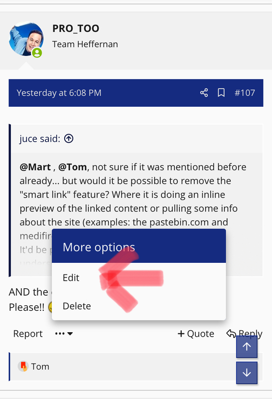
@Mart , @Tom, not sure if it was mentioned before already... but would it be possible to remove the "smart link" feature? Where it is doing an inline preview of the linked content or pulling some info about the site (examples: the pastebin.com and mediafire links)
It'd be perfect, if they were again just regular underscored hyperlinks.
Thanks.
It'd be perfect, if they were again just regular underscored hyperlinks.
Thanks.
Last edited:
PRO_TOO
Team Heffernan
AND the edit button!@Mart , @Tom, not sure if it was mentioned before already... but would it be possible to remove the "smart link" feature? Where it is doing an inline preview of the linked content or pulling some info about the site (examples: the pastebin.com and medifire links)
It'd be perfect, if they were again just regular underscored hyperlinks.
Thanks.

Please!!

thapelo
What? League what?
- 13 October 2015
PRO_TOO
Team Heffernan
No. That one!This edit button?
View attachment 24428

There are some more minor things that could be improved for regular mobile view.
juce
Champions League
- 7 November 2003
The content inlining from links ( especially long files from pastebin.com ) completely f*s up mobile devices.  Seems to work slightly better on a computer, but it is still a hassle to scroll it away... If this can be turned off somehow, i will never complain about any other aspect of UI ever again.
 Seems to work slightly better on a computer, but it is still a hassle to scroll it away... If this can be turned off somehow, i will never complain about any other aspect of UI ever again.
- Thread starter
- Staff
- #111
juce
Champions League
- 7 November 2003
@Mart , this post, for example:
https://evo-web.co.uk/threads/sider-module-kitserver-2020.81143/post-3466307
https://evo-web.co.uk/threads/sider-module-kitserver-2020.81143/post-3466307
- Staff
- #114
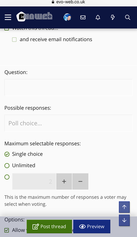
It's there, but bugged (transparent or white font). Searching for "poll" reveals it. Haven't checked on mobile. @Mart will have to fix it.

PRO_TOO
Team Heffernan
eL MaTaDoR
PES VETERAN
So how much is the Cost to have a website like this including server? 

PRO_TOO
Team Heffernan
Including the new XenForo software, mods, admins, chuny’s and all the lovely users from the community?!


- Thread starter
- Staff
- #119
I have a couple of servers that work out around $50 per month each. This is the main site on one and the other is used for backups and other side projects etc. XenForo was initially $160 then $70 per year after that.So how much is the Cost to have a website like this including server?
I'm also very expensive.

The lovely staff as already mentioned are definitely priceless.
I was thinking of offering a supporter-type membership thing for donations, more to try and make the site sustainable without me as opposed to any kind of money maker. What would people think to that?
Chuny
-
- 11 December 2007
I have a couple of servers that work out around $50 per month each. This is the main site on one and the other is used for backups and other side projects etc. XenForo was initially $160 then $70 per year after that.
I'm also very expensive.
The lovely staff as already mentioned are definitely priceless.
I was thinking of offering a supporter-type membership thing for donations, more to try and make the site sustainable without me as opposed to any kind of money maker. What would people think to that?
I'd definitely donate from time to time.


