Joe
International
- 9 August 2004
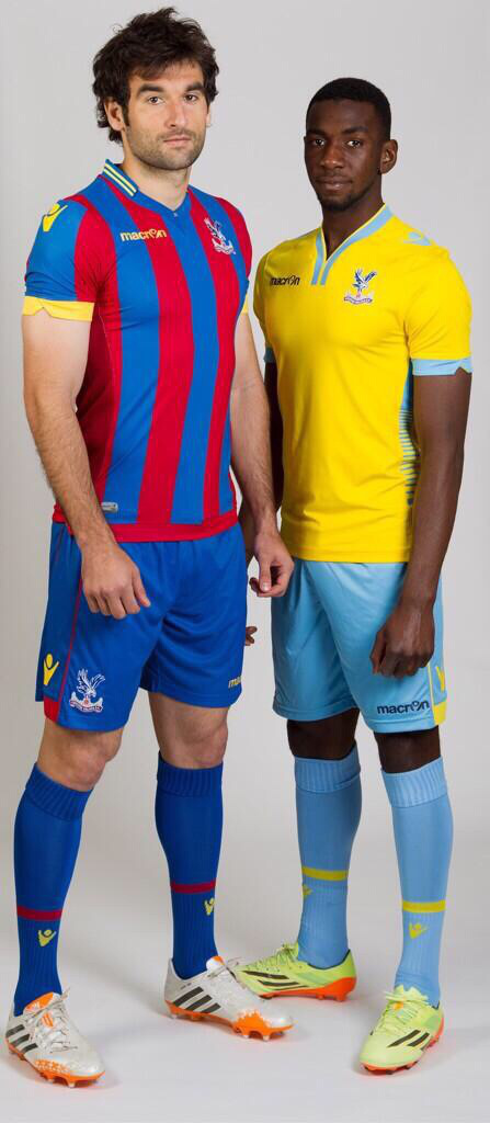
better picture of Crystal Palace kits

Why oh why are we obsessed with yellow on our home kits lately.
Follow along with the video below to see how to install our site as a web app on your home screen.
Note: This feature may not be available in some browsers.
better picture of Crystal Palace kits


Palace kits are fine, Juve must be a joke
bayern remindes me on 90´s


Chinese versionHigher quality pics of the United kits:
http://www.voetbalshirtjes.com/wp-content/uploads/2014/05/manchester-united-home-shirt_2015.jpg
http://www.voetbalshirtjes.com/wp-content/uploads/2014/05/manchester-united-away-shirt_2015.jpg
Home: Mid-nineties/Euro 2012 Puma called,they want their collar back.
Away: That's a leisure tee,right?
All in all: Typically bland,shit United shirts.
My thoughts exactly.Those kits would look so much better with just the word Chevrolet on the front. The full logo is overkill.
Those kits would look so much better with just the word Chevrolet on the front. The full logo is overkill.


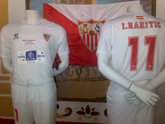
Sevilla UEFA Europe League Final kit

white socks ruined it, should have been blue instead.

Very cheap looking kit.
