Your Own Art thread

How did you make the textured background, is it a case of using a filter or did you have to "draw" it? And how did you get that effect on the Sydney Opera House, is it a case of greyscaling the file, colouring it and then using a filter or...?
 
for god's sake, JACK BAUER that is an absolute piece of piss to make.
 
Lol.

Noted, that's a great piece. I love the work you've done there, there's a really good harmony between the vectors and the rest of the stuff. Nice work.

Jack, as soon as you get to know some basic techniques of Photoshop everything will get easier. All you need to do is to look for some tutorials - check DeviantArt - and start playing with them. You'll see you'll improve a lot in a short amount of time. No one is born with the skills to do anything, so practice makes perfection.
I may help you myself and send you some of my .psd's if you want. Just ask. ;)
 
Last edited:
That Editors wallpaper on your DeviantArt site is fab, I might just use that. :)

I'd feel bad taking your PSDs off you - I'd be more interested in finding out how they're developed (and what exactly you find useful to keep). I mean, for example, a lot of your pictures have the same "deteriorating" look to them (as if they were "printed" fifty years ago) - is that an effect you've developed by drawing it (if you know what I mean), by using a combination of filters or by taking it from an old photo or the like?

I have so many unanswered questions in this thread, I should start my own or something. ;) Sorry for clogging it up guys.
 
I don't mind giving you my PSDs, they're only for learning purposes, aren't they? ;) I don't have any problem with that. :)

I said I'd give you my PSDs because they would help you to understand how things are made. I'd also try to explain how I did it, but being able to explore the file would be a great help in my opinion.

Regarding the "old" look of the pictures, that's just a texture and some lightning effects. I don't usually use Photoshop's filters - except Sharpen, Gaussian Blur and Lens Flare.

As I said, if you guys want me to explain something, just ask. :)
 
partshirt.jpg


Partridge. Might make this into a tshirt.
 
Genius grim! HAHAHHAHAHAHHAHAHHAHAH! I'M RINGING UP THE BBC'S COMEDY DEPARTMENT TO GET YOU A BLOODY JOB YOU BLOODY HILARIOUS BASTARD!
 
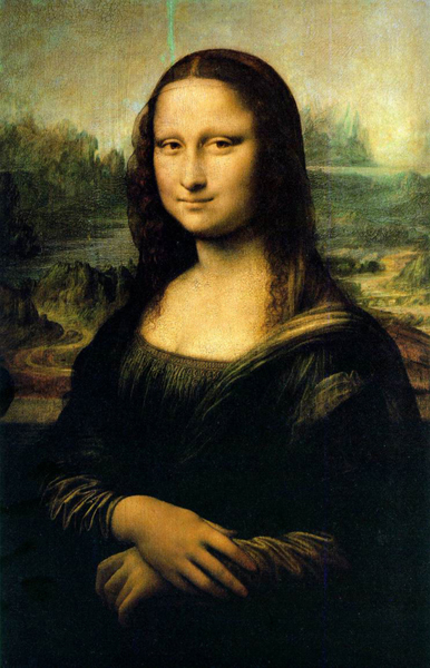
(davinci)-mona-lisa.jpg


Grim: Mona lisa? It looks more like bloody Janice Battersby. You're shit Da Vinci.

LOLOLOLOLOL!
 
Quick question to the art geniuses that frequent this lovely forum... You know the Coca-Cola logo's funky underline?

coke_classic_splash.jpg


Well I was looking to do a similar thing in Photoshop, to place across the top of a webpage (but without the "twist" in the middle). I was looking at making three seperate wavy lines of different colours, just like in the above logo (theirs are bubbly grey, white and yellow), but rather than have a gap between them as above I wanted them to be stuck together, making one thick multi-coloured wavy line.

How is this possible in Photoshop? I had a fiddle with the shapes feature, managed to get one line perfect, but when I copy-and-pasted it underneath it didn't "fit" with the above line and so there were gaps and overlaps.

Any advice would be mucho appreciated. Gracias!
 
Oops, sorry for the big delay, Chris. I've been quite busy lately and couldn't find the time to reply to your email (and send you some PSDs).

Regarding the wavy lines you would like to make, I'm not the best person to help you. Those lines should be done either in Illustrator or in Photoshop (using something like the Pen tool). I have no experience with these tools, so I have no clue about how to make the lines. Hutch could help you a lot more than me, I guess.

Regarding the preview of the website you've been working on you've sent me, to be honest I like it. That's a different and original design, but I think you could work a bit on the colours, I'm not really fond of the blue, for example. Apart from that, it looks good overall. :)
 
That's nice to know, I'm planning on studying big-time this week (the two main sources of me never doing any work, my dad and my girlfriend, are away for the next week or two) so if I can stick to my original design then that's half of the work done. :) I've made a (hand-drawn) prototype for a design based around the aforementioned wavy lines, but without being able to draw them on the PC I'm a bit stuck, haha.

I wasn't really a fan of the blue either but there's three parts of the site which are going to be colour-coded, one has to be blue, one has to be green and the other has to be sky blue - so I can have a dark blue, but not a light blue as there's already a section with that colour. I suppose I could go for a patterned design, coloured stripes or waves or something...

Don't worry about the delay in replying to that email either, your work has to come first mate, I totally understand. Love the new avatar by the way!
 
Do you mean something like this Jack?

untitled1ov5.jpg


If so then you need to learn how to use the pen tool. Google some Photoshop Pen Tool tutorials and there are literally hundreds. Basically you "draw" a wavy line with the pen tool. Give it a "stroke" which is basically a line and there you can set the thickness. Then you can copy and paste that wavy line and layer it so they other lines are underneath the thick one. Play around with the colours and layering and you will get something like the above which I knocked up in a few minutes.

MSN me Jack if you want some help I'll be happy to help
 
I've tried to do some userbars when there was the "userbar-mania" some months ago.. here are some (the best ones, because the other ones were reeeeeeeeeeeeaaaaaaaaaally CRAP!!)

Adidas:
adidastj5.png

Adobe:
adobe5ca.png

Amd:
amd5gd.png

Blank & Jones (this will probably suit proxi if he reads this thread \\:o/ ):
blankjones0wx.png

Non Ne Possiamo Più:
nnnepossiamoja5.gif

No Name Boys:
nonameboys6mq.png

ResidentEvil:
residentevil9rq.png

Valentino Rossi (took the idea from a sig seen on a forum, but it's 100% from scratch):
vale7em.png

Virtua Striker
virtuastriker1la.png

Virtual DJ:
virtualdj1mx.png


:lmao: too bad that userbar-mania seems to be over!!
 
Noted, that's almost what I mean, but the bar wouldn't be an equal height all the way through - it would start thick, go smaller, go thicker again, go smaller etc., if you see what I mean. I managed to get one perfect line using Photoshop, but I couldn't split it into three new lines (and like I said, you can't copy and paste it on the bottom because it's not an exact fit). I'll look around for tutorials anyway - and cheers for the advice, I really need it. :)

Kleimann, those are some awesome userbars, love the Adidas one - shame we can't have graphics in our sigs here or I'd have tons in there, I'm still a userbar fan. :mryellow:

EDIT: How beautiful is this?

33okyvt-1.gif
 
Last edited:
res.jpg


Tribute to the best song ever. All pretty much hand drawn/painted then bringing it all together in Potatoshop.
Could anyone please give me any tips for making the photo of the painting look less like a photo? I.e- taking away the flashes.
Any tips or hints in general as to how to make the whole thing look better are also appreciated, as I'm planning on getting this printed as a poster.
Ta.
 
Not a big fan of the font or the black background. Maybe you could find a way to make the background more interesting to go with the colours in the photo. As for touching up the photo that could be quite difficult without literally using a brush in photoshop to blend it together.

And, miguel, I like the style of your wallpapers etc. Are you just using a golden layer above the photos and then using blending options?
 
The golden look of it is due to a book (paper) texture that I've used above all the layers set in Multiply. There isn't any blending option set in any of this wallpaper's layers. :)

By the way, I'm glad you like it... :p
 
Hmmm. The font's a bit homosexual due to me drawing it out myself and scanning it. I wouldn't usually do that but I'm an up my own arse arty type these days and thats how we roll apparently..
I reckon I might re-do the painting tomorrow. If I fill a page with the crazy colours then write more lyrics (which was the original plan) in white, then I can just single out the middle part for the cross and make that brighter. Might look a bit COOL that homeyzzzzzzzzzzzzz.
 
Just a simple and clean wallpaper. I like it. :)


By the way, did you get my PM, Chris?

That's ace miguel. :applause:

Although I think the term "of Hamburger" is not quite right. "of Hamburg" or "from Hamburg" would be correct I guess. Still great job. :)
 
Last edited:
DIVE

a wallpaper i made. :D
inspired by miguel's ronaldo wheel barrel one.

any comments on how to improve would be appreciated.
 
Last edited:
Back
Top Bottom