Daniel_Juve
kitmaker
- 29 November 2011
- Team
- Juventus
See!
"IS" all in.
And yeah S-NipE, I like this campaign too, it sounds cool.
"IS" all in.
And yeah S-NipE, I like this campaign too, it sounds cool.
Follow along with the video below to see how to install our site as a web app on your home screen.
Note: This feature may not be available in some browsers.
English commentators always say "Chelsea are head", "Arsenal have done the job". It's like a group of people.Should be 'is' not 'are'.
See!
"IS" all in.
And yeah S-NipE, I like this campaign too, it sounds cool.


It might be related to the native language from where team is coming. I mean, English clubs "are all in", while now Partizan and if I am not mistaken German teams are with "is all in". Here in Ex-Yu nations we don't refer to teams in plurals. We don't say for example: "Hajduk are in the lead" (Croatian: "Hajduk su u vodstvu"). Instead, we say "Hajduk is in the lead" (Croatian: "Hajduk je u vodstvu").
So it might be that Adidas is adjusting their promo campaign with regards where does team come from
")
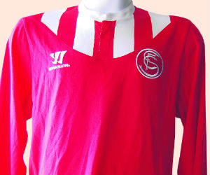
Sevilla leaked
I don't get what adidas were trying with the gk kit though.
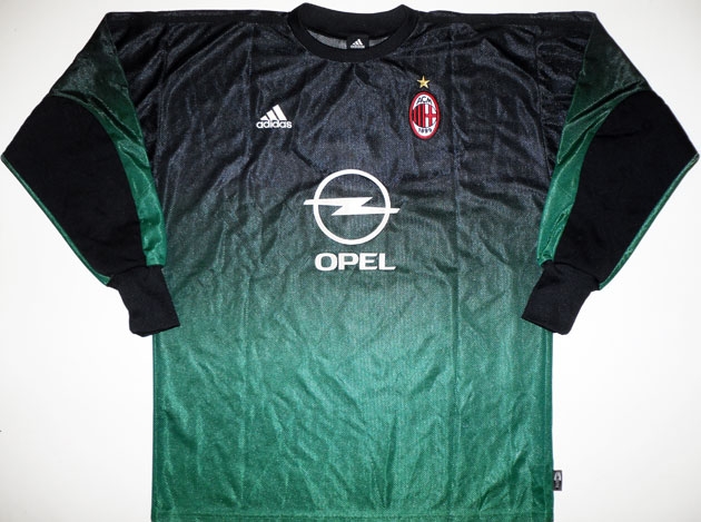
omg this looks so crapy , how the hell someone can make such a ugly kit ?


