My PES 2022 Menu UI Design

Which menu design do you prefer?

  • 1

  • 2

  • 3

  • 4

  • 5

  • 6

  • 7


Results are only viewable after voting.
What font(s) are you using mate?
How could these slides of yours be implemented into unreal engine? ...how does that stuff work?

Last time I build a menu on PC it was for some dvd’s back in the early 2000’s.

The font is called Bebas Neue. As far as coding into unreal engine goes I have no idea lol, i'm strictly a designer, i never delved into the development side of things
 
Hello all!

After a couple busy months, i've had some time to put focus back onto the menu design. I still haven't come to a decision on which menu version to use, but i've begun working on designing other screens and will decide which main menu screen fits the best with my design language.

Here we have a flow of navigating from the main menu --> Kick off --> Side Select --> Team Select --> Kit Select --> Match Overview

The idea here is to have everything transition fluidly inside the same space, and the neon pitch will be animating between the two perspectives. I have designed these flows in both a light mode and a dark mode. Which would you all prefer? Or would you like the option to toggle between both? Any and all feedback would be wonderful!


EDIT: For some reason the preview here has the flow out of order, please click the links to see the flow
 
Great work! For me it was between #1 and #5. I opted for #5 because having the titles of the sub-categories over the pictures made them easier to read.

jTNQUOP.jpg
 
Ffs, If someone can create such a wonderful menu theme here on the forum, I seriously don't get why Konami cannot.
These menus are just wonderful and I will take any one of these over the God awful menus in recent games.
Seriously, how hard can it be for such a big company to create a good looking, user friendly UI like this?! just shocking.
Same can be said for the yellow grass in PES. It's a football game, and they can't get the color of the grass right. Grass is not patented or licensed.
 
Great work! For me it was between #1 and #5. I opted for #5 because having the titles of the sub-categories over the pictures made them easier to read.

jTNQUOP.jpg
How about this?
The Light theme will be used whenever the Match you play is in daytime, and the night theme when at Night. Would feel amazing.
For Exhibition I say pick a different colour and stick to it, the light/dark theme switch could be done only in ML, BAL and myClub maybe.
Would look nice.
P.S I speak as if I am speaking with Konami mate. Menus themes look great.
 
Finally made a decision on the menu layout, I feel this structure works best for navigation and consistency across the rest of the screens I will be building. As much as I hate the "eFootball" branding, I want this to be a real case scenario, so I wanted to adopt the colors of the eFootball logo

 
Finally made a decision on the menu layout, I feel this structure works best for navigation and consistency across the rest of the screens I will be building. As much as I hate the "eFootball" branding, I want this to be a real case scenario, so I wanted to adopt the colors of the eFootball logo
This is a thing of beauty. It's clear, concise, Very stylish and not busy or overwhelming at all.

This can even be considered a "basic" or "simple" menu because it doesn't have loads of activity or 3D models all over the place like some game menu's do but it's slick and functional. Whereas on 2020 & 2021, It's literally so basic that it looks cheap and nothing like a premium current gen title.

I've seen more polished and enthusiastic looking menu's on indie games made by a lone developer.

Appreciate the kind words friend!

I've got some more updates. Here is my current design and flow for playing a local match. I'm considering changing the font due to its FIFA-ish appearance, although FIFA isn't the only game to use an all caps font.

PS. Just wait until you see how these screens transition/animate together :COOL:
Love it, I think in general when it comes to creating something, There's nothing wrong with borrowing from something that is established as being functional or just works. All caps on menu's is clear and concise and the user identifies what it means instantly. An example of bad type face on menu's is WWE 2K19 when they used grey text on a bright white background and it was a nightmare especially for those that needed accessibility assistance.

Though i do like the team crests on the match screen, Gives it a Retro FIFA feel, similar to how it looked on the PS2 games and speaking of WWE 2K, I like the stances of the players on the kit screen. No cool poses or nothing, Just basic and presentable. I hated how on PES 2011 they had players folding their arms like they we're bad asses but you couldn't see their shorts or socks until you went into the kit selection screen. My idea of good menu design is something that doesn't require the user to go through 3 different screens to get to where they need to be.

I miss the quick change of a player on the pause screen too. The quick sub in cutscenes is fine when you wanna simply switch a striker in but it gives me anxiety when i want to ponder about a defensive change on the fly without having to wait for the formation screen to load!

There needs to be middle ground and we need the quick change option back!


Love the enthusiasm and constructive feedback! I agree with the statement on borrowing, I guess i'm overly focused on making it something completely original. Simple and efficient is what i'm going for. I want everything to happen and transition within the same space, breaking the idea of "different screens", so it all appears to be happening within one screen
 
The program i'm using (Adobe XD) isn't playing too nice with the 3D field, but here is a rough idea of how this flow would transition/animate between screens

 
Last edited:
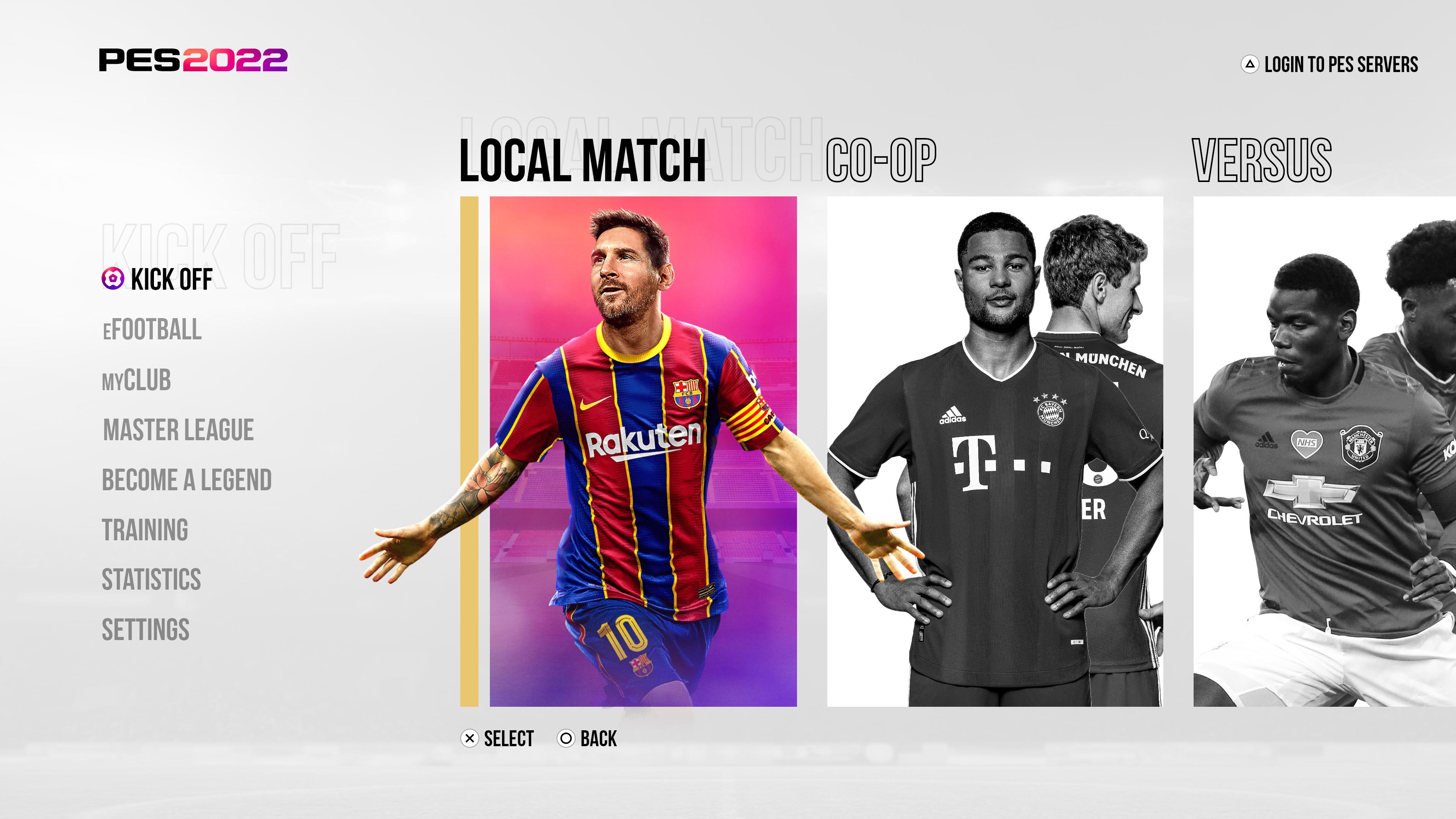
So I decided to go a whole new direction with this (again lol). I've been noticing the new trend in game menu design includes having a 3d in game environment (CoD, Fortnite, FIFA, among others). Today I went and researched a bunch of menus, and came away with a surge of inspiration, creating this!


NOTE: the 3d rendering of Messi is obviously and unfortunately not eFootball graphics, but rather a phenomenal 3d render I found online, which I then had to pain-stakingly edit in order to transform the kit to match the myclub kit Messi is wearing in the eFootball promo ads. Safe to say I am very pleased with the result, and this is my favorite menu design thus far! I promise no more veering off, this is the one I am going with, and will redesign the remaining screens to match.

I also included a ultrawide version for fun, since I am working on an ultrawide monitor. Click the imgur link to see!
Greetings to you and I wish you success. And I must say that your work in this field is extraordinary 🤗. I know for a fact that According to evo rules, you should not ask an editor the release date of a project, but a question has been on my mind for about two weeks, whether you are going to publish or there is still a lot of work to be done, because I am very excited about this mode🤩. Thank you very much .
 
So I decided to go a whole new direction with this (again lol). I've been noticing the new trend in game menu design includes having a 3d in game environment (CoD, Fortnite, FIFA, among others). Today I went and researched a bunch of menus, and came away with a surge of inspiration, creating this!


NOTE: the 3d rendering of Messi is obviously and unfortunately not eFootball graphics, but rather a phenomenal 3d render I found online, which I then had to pain-stakingly edit in order to transform the kit to match the myclub kit Messi is wearing in the eFootball promo ads. Safe to say I am very pleased with the result, and this is my favorite menu design thus far! I promise no more veering off, this is the one I am going with, and will redesign the remaining screens to match.

I also included a ultrawide version for fun, since I am working on an ultrawide monitor. Click the imgur link to see!
Dude :) you are amazing! Too bad that a multi-billion company like Konami doesn't have a single guy like you and we will get awful basic ugly eF menus.
 
I'm actually laughing :LMAO:Can't believe someone has started leak rumors about my design. The WC 2014 ball should be a dead giveaway that it's not real
At least seeing the positive part, even those who were sceptical, acknowledged that this seems too good to be work by KONAMI. So people in the community find your work better than the multi billion company. That's good even if it was produced by "false positive".

What is wrong with these morons.

I hope the guy gets banned for that post. Clearly starting the "rumours" himself.
Chris yeah it is really sad and enraging sometimes, completely an abuse of social media era, combined with bad communication by KONAMI here. When the communication by the devs is so non-trasparent, an empty field for all those rumor makers and pseudoginsiders is created.
 
Back
Top Bottom