Gedtillo
Mediocentro defensivo
- 13 July 2004
Badge templates, kits and editing guidelines by Gedtillo
Credit to dannyboy20, Lisso, snigletAteam and others where due. Thanks for their work.
How to create your own badge templates, by snigletAteam:
Here's a guide to create the most accurate templates for in-game badge and sponsor editing ever. Follow the next steps in order. You'll need an image editor such as Photoshop.
1. Download emblem from:
http://www.answers.com -> This is the best choice
http://www.brandsoftheworld.com
They seem to have most of the major clubs
2. Import the .eps into Photoshop or similar. Make sure you crop right to the edges of the logo.

3. Resample the image so that it is 48 pixels in height (the maximum height allowed in the badge editor.

When you do this, I recommend sampling down in stages (i.e. if your original was 600 pixels high, go to 300 pixels, then run the sharpen filter, then 150 pixels, sharpen, then 100 pixels, sharpen then size down to 48 pixels. This seems to give better results than a straight resize).
4. Set your photoshop grid have a gridline every 2 pixels and one line between. Zoom right into the image (or as far as you can go so it all fits on the screen).

Important note: By using a gridline every 1 pixel and with no subdivisions you can achieve a template that is EASIER to follow.
And finally...
5. Screen grab and the paste this into a new document. Crop and print out as large as you can. You now have a perfect pixel map of your teams logo!

Pixel size:

Original link: http://www.soccergaming.tv/showpost.php?p=1538706&postcount=38 - Credit to snigletAteam, thanks for his guide.
-EDIT-
Here's what we have up to now:
Templates : - credit to dannyboy20 where due
Manchester United (created following tutorial):

Liverpool 2005 badge (created following tutorial):

Comparison of how these new badge templates show up against the originals:

Croatia badge:

Pixel size:

Everton FC:

Croatia (easier) and Brazil:

Liverpool (old badge):


New adidas logo (smaller, by dannyboy20):


England Badge:

Manchester United:

Manchester United (by - por Dannyboy20):

Newcastle United (zoom- by Dannyboy20):

Aston Villa (zoom - by Dannyboy20):

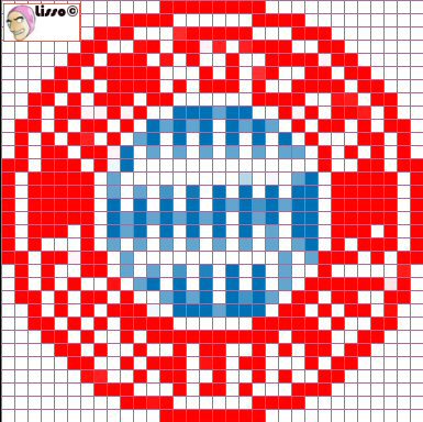
Bayern München:
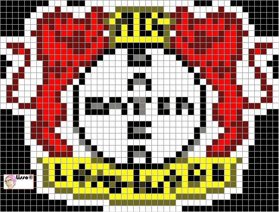
Bayer Leverkusen:
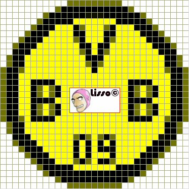
Borussia Dortmund:
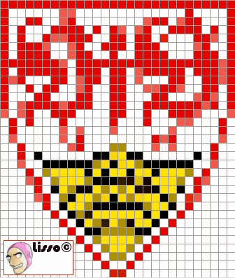
Stuttgart:
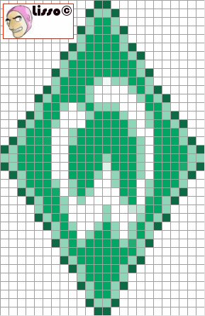
Werder Bremen:
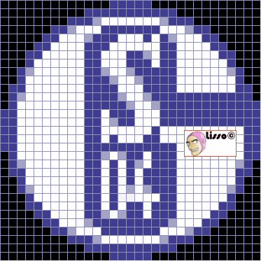
Schalke 04:
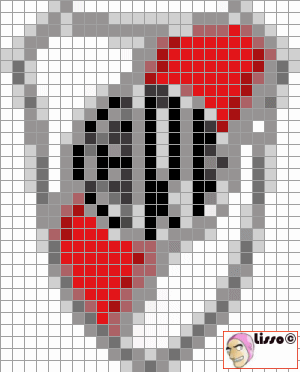
River Plate:
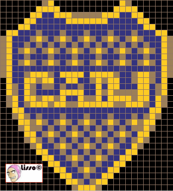
Boca Juniors
Olympiakos
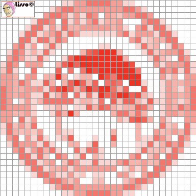
Celtic
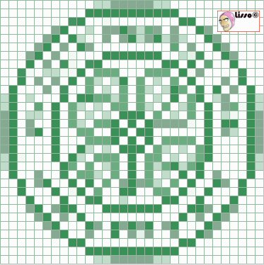
Ireland:

National team kits:


--
If you follow these instructions you will be able to get kits like these:


Credit to dannyboy20, Lisso, snigletAteam and others where due. Thanks for their work.
How to create your own badge templates, by snigletAteam:
Here's a guide to create the most accurate templates for in-game badge and sponsor editing ever. Follow the next steps in order. You'll need an image editor such as Photoshop.
1. Download emblem from:
http://www.answers.com -> This is the best choice
http://www.brandsoftheworld.com
They seem to have most of the major clubs
2. Import the .eps into Photoshop or similar. Make sure you crop right to the edges of the logo.

3. Resample the image so that it is 48 pixels in height (the maximum height allowed in the badge editor.

When you do this, I recommend sampling down in stages (i.e. if your original was 600 pixels high, go to 300 pixels, then run the sharpen filter, then 150 pixels, sharpen, then 100 pixels, sharpen then size down to 48 pixels. This seems to give better results than a straight resize).
4. Set your photoshop grid have a gridline every 2 pixels and one line between. Zoom right into the image (or as far as you can go so it all fits on the screen).

Important note: By using a gridline every 1 pixel and with no subdivisions you can achieve a template that is EASIER to follow.
And finally...
5. Screen grab and the paste this into a new document. Crop and print out as large as you can. You now have a perfect pixel map of your teams logo!

Pixel size:

Original link: http://www.soccergaming.tv/showpost.php?p=1538706&postcount=38 - Credit to snigletAteam, thanks for his guide.
-EDIT-
Here's what we have up to now:
Templates
 : - credit to dannyboy20 where due
Manchester United (created following tutorial):

Liverpool 2005 badge (created following tutorial):

Comparison of how these new badge templates show up against the originals:

Croatia badge:

Pixel size:

Everton FC:

Croatia (easier) and Brazil:

Liverpool (old badge):


New adidas logo (smaller, by dannyboy20):


England Badge:

Manchester United:

Manchester United (by - por Dannyboy20):

Newcastle United (zoom- by Dannyboy20):

Aston Villa (zoom - by Dannyboy20):

Bayern München:

Bayer Leverkusen:

Borussia Dortmund:

Stuttgart:

Werder Bremen:

Schalke 04:

River Plate:

Boca Juniors

Olympiakos

Celtic

Ireland:

National team kits:


--
If you follow these instructions you will be able to get kits like these:


Last edited:


 Thank you, Sea Bass, you made me happy.

 so we won't be able to share. But it's very easy and quick:


